
Watch illustrations
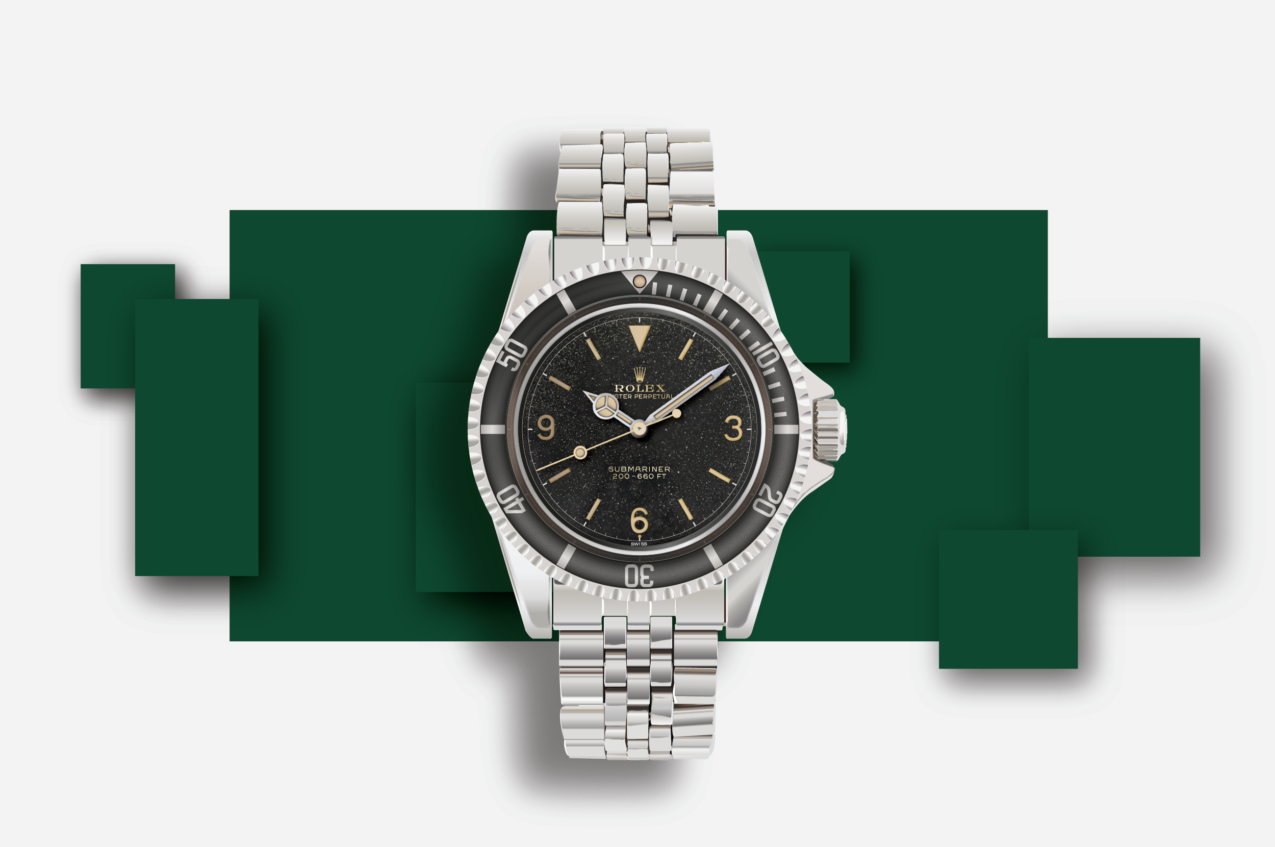
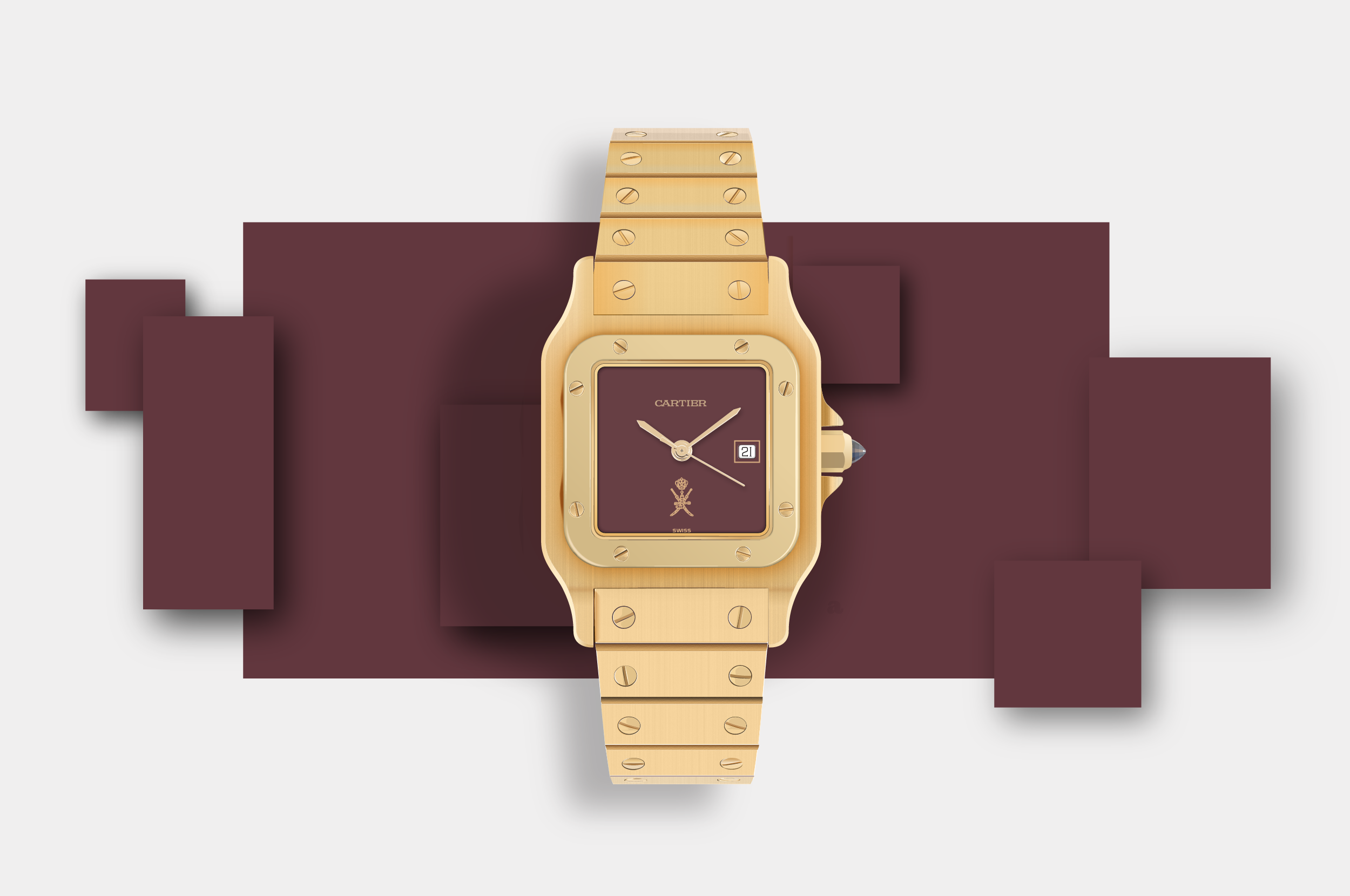
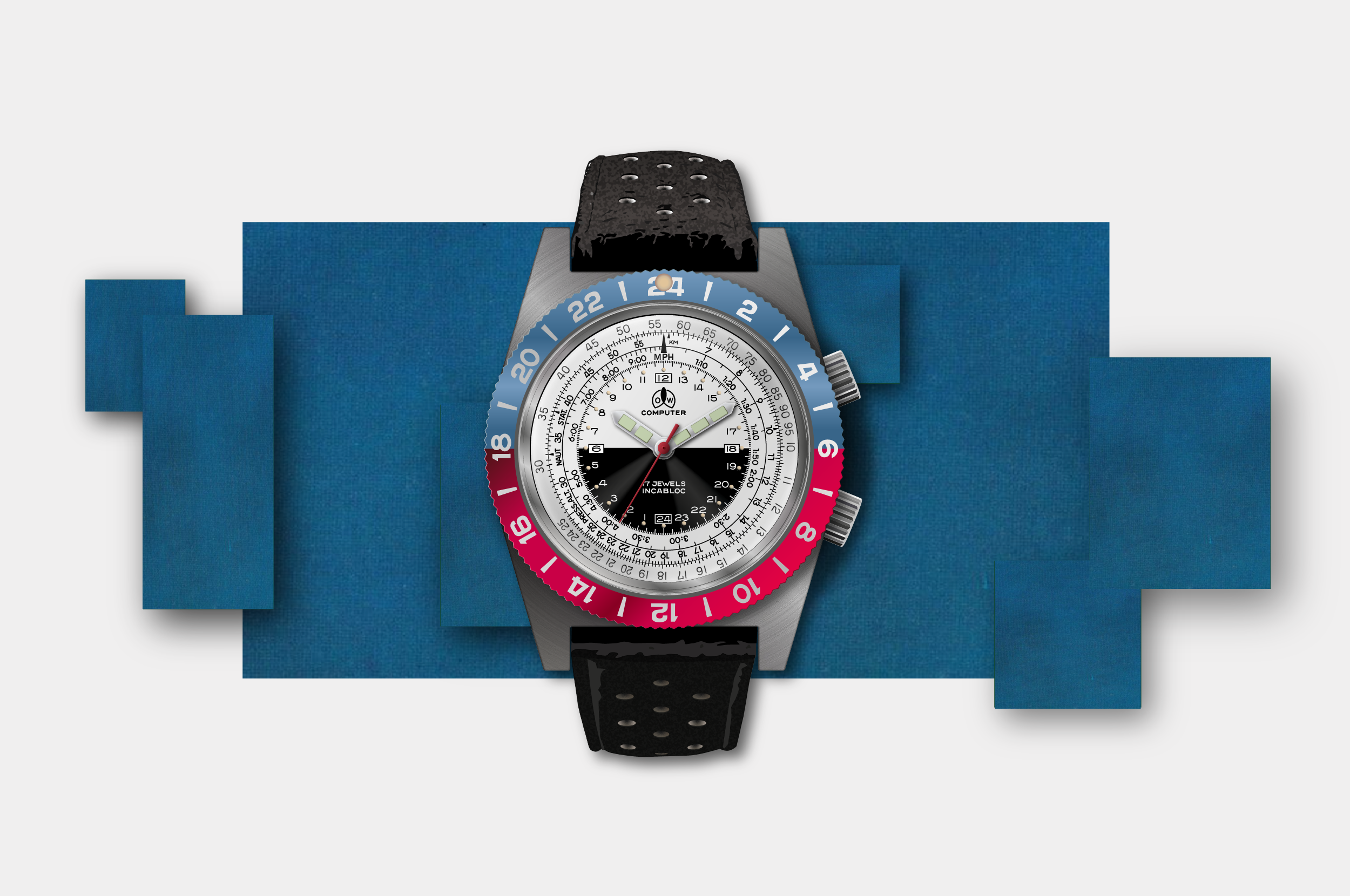
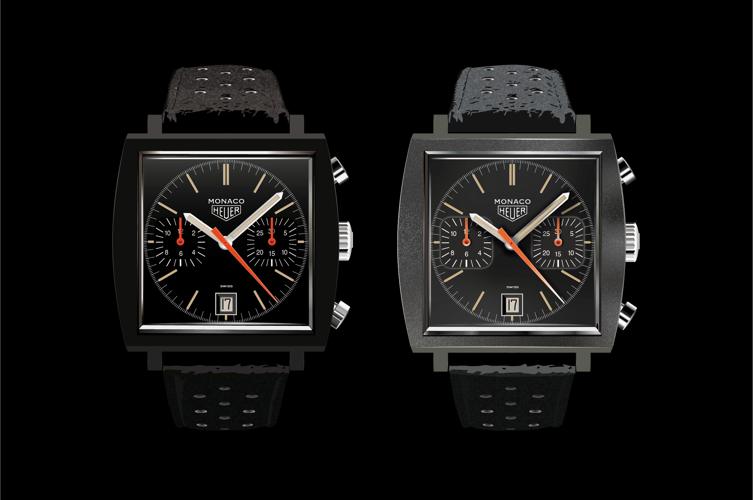
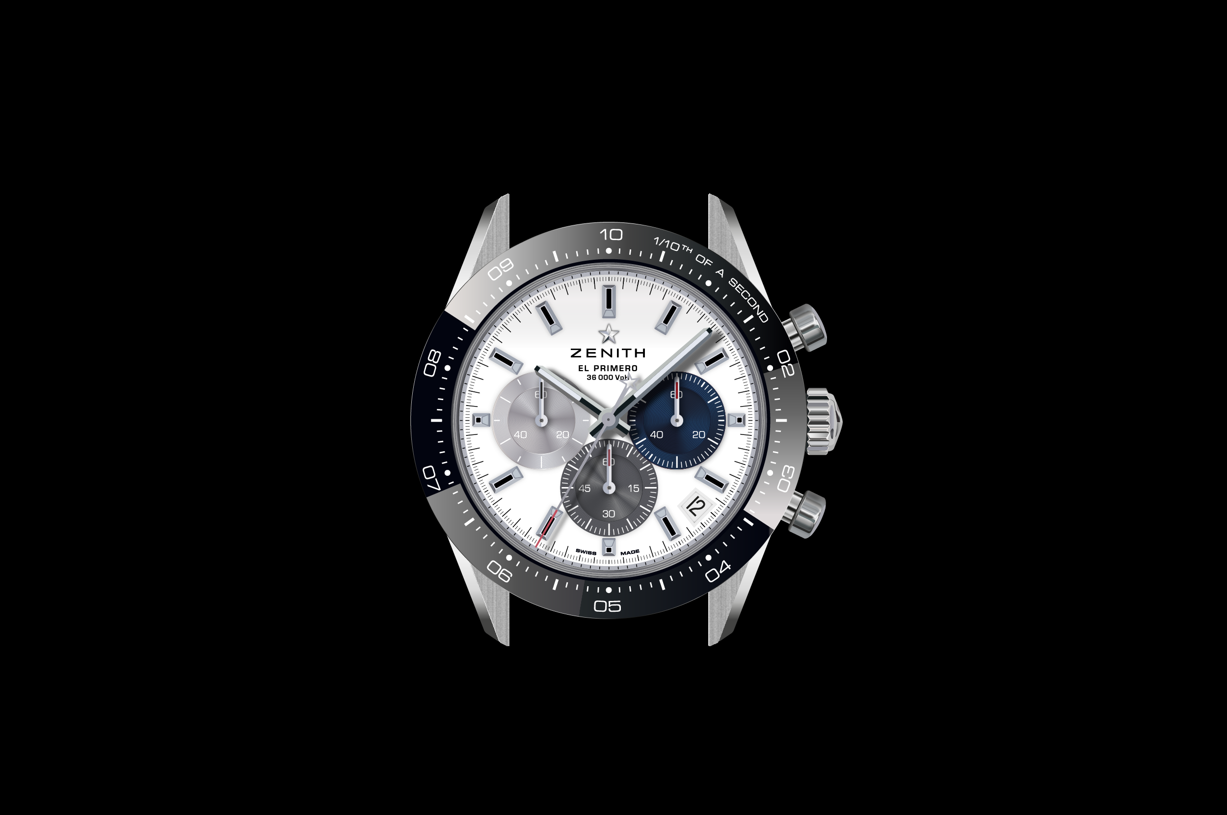
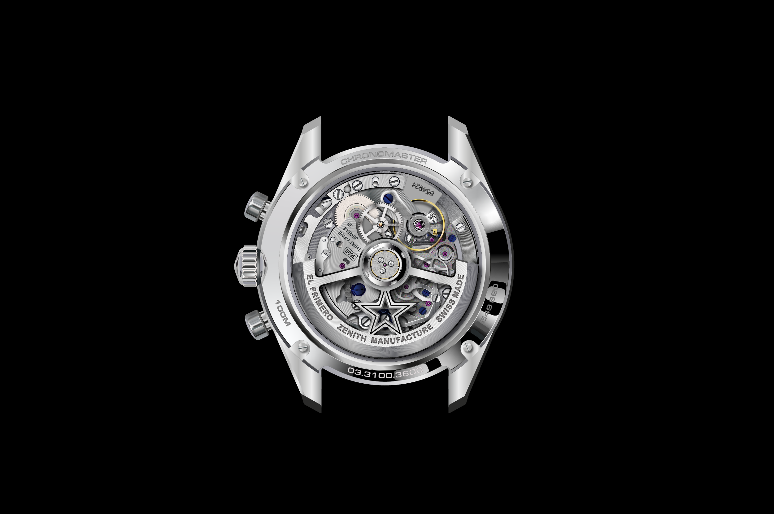
I’m a watch fan and have a small collection, but I had never looked at watch typography all that closely. For a project I had to redraw some wall clock faces and doing this makes you really study an object and look at it with fresh eyes. I then started to look at wristwatches I liked and decided to redraw those as an exercise. Interestingly, typefaces that are used a lot on watches are: Eurostile, Copperplate, and Sackers Gothic. Interestingly – and maybe shockingly – there is also a lot of Arial and Times New Roman.
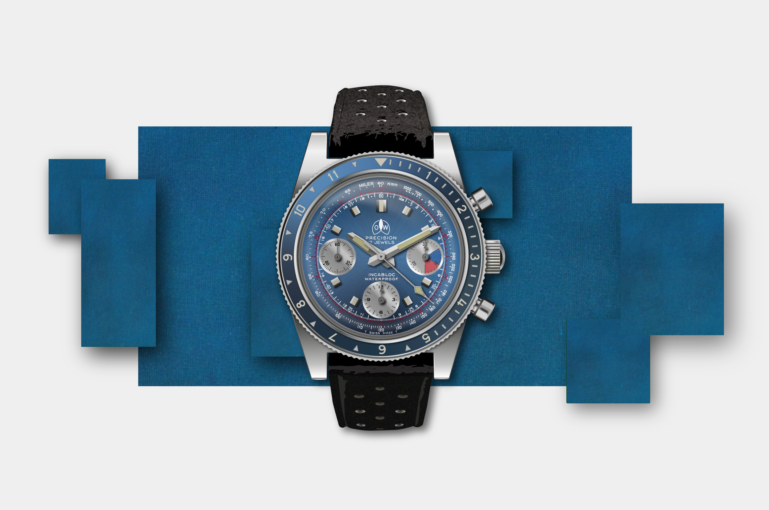
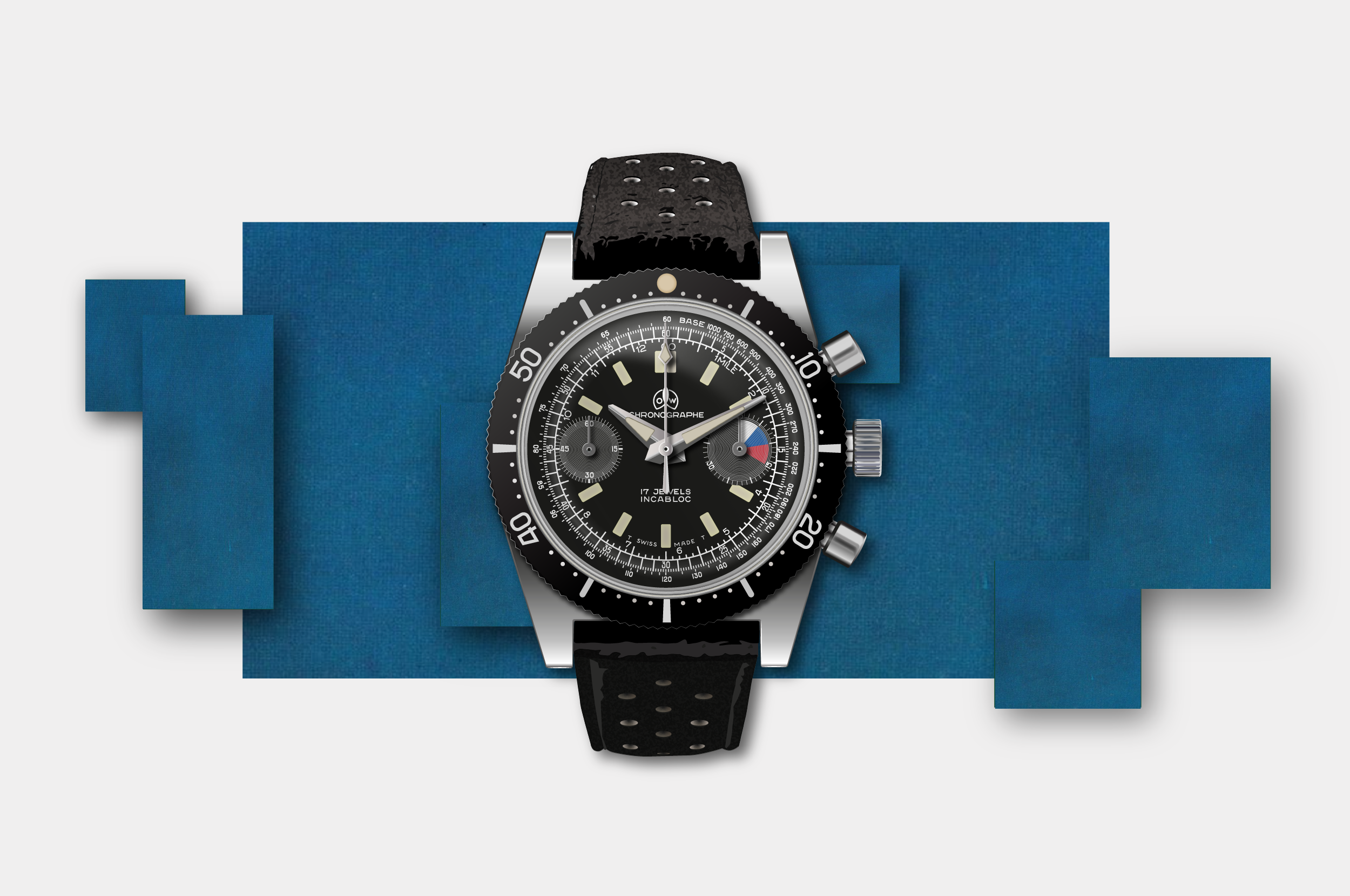
I have been interviewed by Time + Tide, Revolution Watch, and Il Giornale degli Orologi about my work and my view on watch typography. My illustrations have been featured by Hodinkee, Il Sole 24 Ore, and Wristcheck. Recent projects I worked on were for Ollech & Wajs and TAG Heuer.
If you need your ideas visualised or help with the design of numerals, please get in touch.


Clock faces.
The following are faces of small clocks that I discovered. I liked them because they are slightly quirky and as always I was interested in the typographic treatment of the numerals. I will add to this section when I come across some new interesting faces.


